- Design Archive Feature
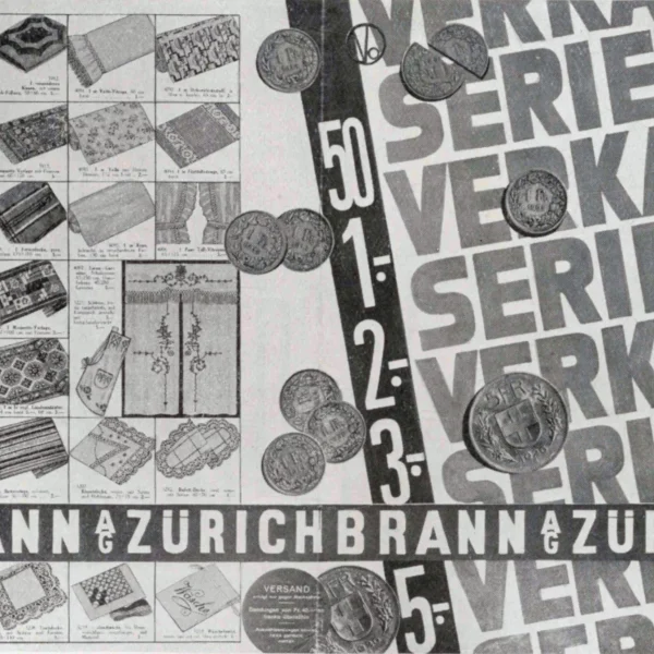
An article by Jan Tschichold illustrated with examples of publicity produced by Brann of Zürich.
- Design Archive Feature, Design Outlook
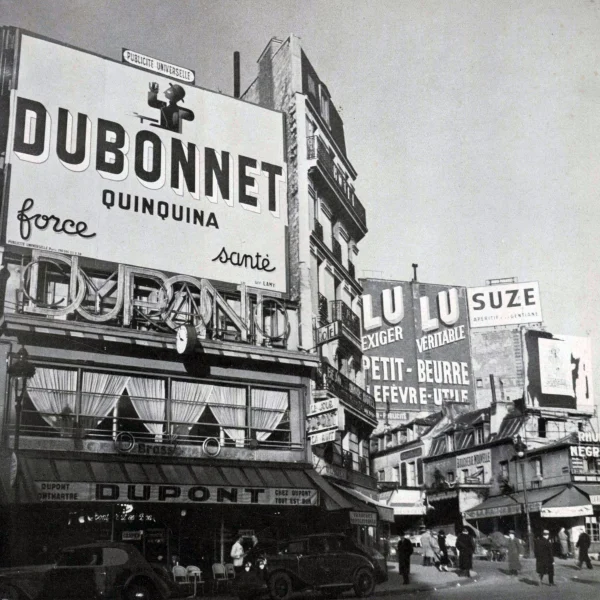
The Paris Poster Hoardings of 1938. Posters gleam forth accentuating the melody of this city as they direct the eye to articles of everyday use and above all to people who are the talk of the hour.
- Design Outlook
The first American university to accept graphic designers as members of the faculty was the Massachusetts Institute of Technology, called M. I. T, for short. The work created by the design group reflects the high level of instruction, the realistic setting of the training and the progressive philosophy of this institute.
Members Content
- Design Archive Feature, Members Only Content
Oldřich Hlavsa worked primarily in publication design and typography and played a major part in Czech graphic design history. He designed over 2000 book covers and published a series of his own books related to typography.
Members Content
- Design Archive Feature, Members Only Content
Interiors was an American magazine published by Whitney Publications, New York and ran from 1940. Before being relaunched as Interiors, the magazine was originally called The Upholsterer which ran from 1888 until 1940.
Members Content
- Design Archive Feature, Design Inspiration, Members Only Content
Walter Ballmer was a Swiss graphic designer born in Liestal, Switzerland in 1923. He worked across various design disciplines including advertising design, packaging, typography and exhibition design.
Members Content
- Design Archive Feature, Design Inspiration, Members Only Content
Publimondial was founded André Roulleaux in 1942 and remained in circulation until 1960. The French journal was published by Art et Publications and was subtitled ‘The Magazine of Graphic Arts and Advertising Technique’.
Members Content
- Design Archive Feature, Design Inspiration, Members Only Content
Stephan Kantscheff (Stephan Kanschev) was a Bulgarian artist born in Kaefer, Todental. His colourful palette and joyous, folk-esque illustrations won him many commissions and his work was celebrated for both its quality and social significance.
Members Content
- Designer Profile, Members Only Content
Karl Oskar Blase was born in 1925 in Cologne, Germany. He was a prolific painter, designer, sculptor and exhibition curator. His work included magazine covers, for publications such as Form and Gebrauchsgraphik, stamp designs for the German Postal Service and film posters for companies such as Atlas Films.
- Designer Interview
"Talking about myself as a designer is something that requires a powerful dialogue with my life experiences. In a radical way, I apply an exercise in which design forms become projections of life, extensions of meaning that constantly involve senses."
Members Content
- Design Archive Feature, Members Only Content
The Best Swiss Posters Award was an annual competition, judged by a Swiss Jury. They selected a range of posters, showcasing a range of poster styles from completely typographic designs such as the work of Robert Büchler, to the illustrated posters of Donald Brun.
Members Content
- Design Archive Feature, Members Only Content
The identity manual consisted of 130 pages of information and brand usage with Arie J. Geurts heading up the project as design director, (who later headed up his own design studio in Los Angeles). The identity uses minimal colour and focuses on a consistent brand blue in all communications.
Members Content
- Design Archive Feature, Members Only Content
Giovanni began his work with Olivetti in March 1938, and his work was showcased in various exhibitions and had a clear distinctive style that amplified the Olivetti brand image. His design defined the company’s visual image, and the iconic geometric designs are still as powerful and engaging today as they were in the 1950s.
Members Content
- Design Archive Feature, Members Only Content
One of Otl Aicher's lesser-known works was the identity and publicity for the Gastein Valley. Gastein valley was a resort for the elderly, an Austrian Alpine village in the Austrian state of Salzburg
Members Content
- Design Archive Feature, Members Only Content
Many designers played an important role in IBM's graphic identity and implementation including Arthur Boden, Clarence Lee, Charles Keddie and Mary Beresford.
Members Content
- Design Archive Feature, Members Only Content
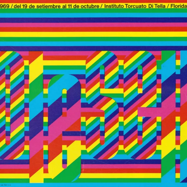
In my previous article about the design work produced for Insituto di Tella, I touched upon the artists Juan Carlos Distéfano, Ruben Fontana and Juan Andralis. After further research, I found a suite of other designs they had produced, including exhibition posters, concert programmes and record sleeves.
Members Content
- Design Archive Feature, Members Only Content
Bäumer gave the company a unique brand image amplifying its graphical image after a time of post-war economic recovery. This style of advertising composition can be seen across many 1960s campaigns, especially from other German designers such as Anton Stankowski.
Members Content
- Design Archive Feature, Members Only Content
Jean Carlos Distefano is an Argentinian artist, designer and teacher. He designed a range of posters, programmes brochures and book covers alongside Juan Andralis, Humberto Rivas and Roberto Alvarado for the Instituto di Tella, Buenos Aires.
Members Content
- Design Archive Feature, Members Only Content
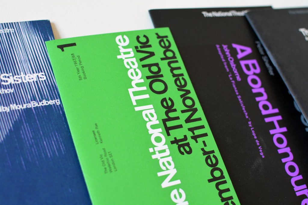
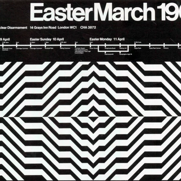
Ian McLaren and Ken Briggs produced exceptional work for a range of clients in the arts and culture sector. Their client included CND (Campaign for Nuclear Disarmament), The National Theatre and the Arts Council.
Members Content
- Design Archive Feature, Members Only Content
A total of 24 posters were created for the campaign during 1964, using the arrow symbol as a key features, representing power, motion and speed. The handmade lithographs use up to 19 colours, which were individually printed at large scale. The posters also utilise the brand colours red and yellow from Shells corporate identity.
- Design Books
"Rudy is one of the unsung pioneers of American mid-century modernist graphic design. He had a unique and definitive point of view that was really never celebrated. This may have been attributed to his strict adherence to the formal principles of modernism and the International Typographic Style."
- Workshops and Lectures
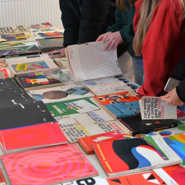
Last month (March 2022), I spoke to over fifty Graphic Design undergraduates about the archive and my passion for design history, after which the students had full access to items in the collection and participated in discourse amongst their peers and lecturers. As part of their critical studies unit, the students will be producing essays and content related to the impact, history and aesthetics of selected artefacts.
- Design Books
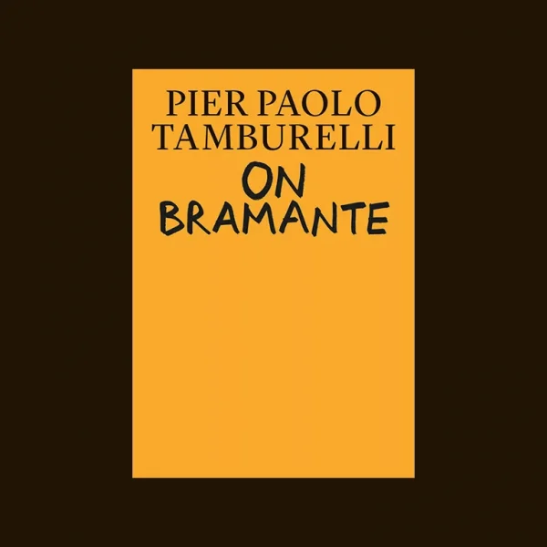
A new interpretation of the work of Bramante, suggesting an agenda for contemporary architectural practice.
- Design Books
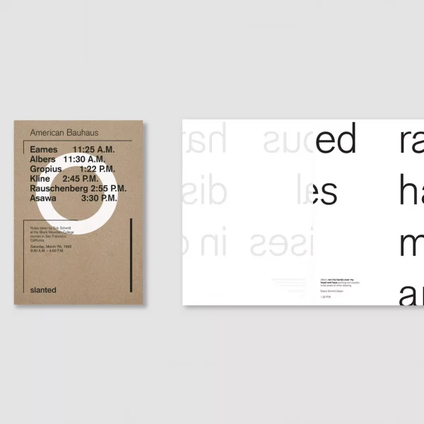
Support American Bauhaus on Kickstarter to pre-finance the project and its production: www.kickstarter.com/projects/908813786/american-bauhaus
- Designer Interview
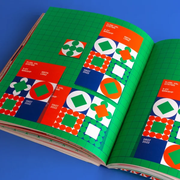
Marin Lorenz has had an amazing career, designing for clients such as ESPN and Nike, teaching at some of Europe's leading design schools and publishing books, such as Flexible Visual Sytems, documenting his research and approach to design practice.
- Design Books
Flexible Visual Systems is the design manual for contemporary visual identities. It teaches you a variety of approaches on how to design flexible systems, adjustable to any aesthetic or project in need of an identifiable visual language.
- Design Inspiration
The Cuban film poster conveys the spirit and ideals of the Cuban revolution. A time of political change, an uprising that ended the brutal dictatorship of Fulgencio Batista. The Danish Film Institute have a collection of Cuban Film Posters from the past 50 years.
- Design Books
Parallel Public is a new publication by Sara Blaylock, published by MIT Press. The book documents the East German artists pioneering work that made their country’s experimental art scene a form of (counter) public life.
- Designer Interview
Mark Bloom has designs for globally recognised brands, produces some of the finest, most accessible modern typefaces and heads up Mash Creative and CoType Foundry. His type foundry has always been a port of call for our studio's brand projects and he continues to develop these, each with a fantastic print specimen.
- Designer Interview
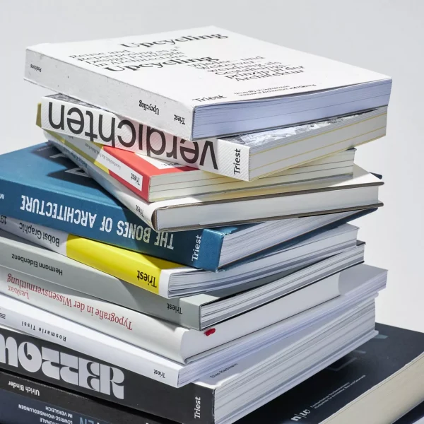
Triest Verlag für Architektur, Design und Typografie are a Swiss independent publisher producing specialist design books in the realms of typography, graphic design and architecture. Their books provide valuable insights and the print production is of exceptional quality. I interviewed the founders, to find out more about their books.
- Designer Interview
I have long been a fan of Counter-Print, as a student, I would order their newsprint publications, peruse their Flickr albums and now, over a decade later I still buy their latest releases and their site provides our staff with great giftse throughout the year. I interviewed one of the founders, Jon Dowling to find out more about setting up Counter-Print, their favourite books and which publishers inspire them.
Members Content
- Designer Profile, Members Only Content
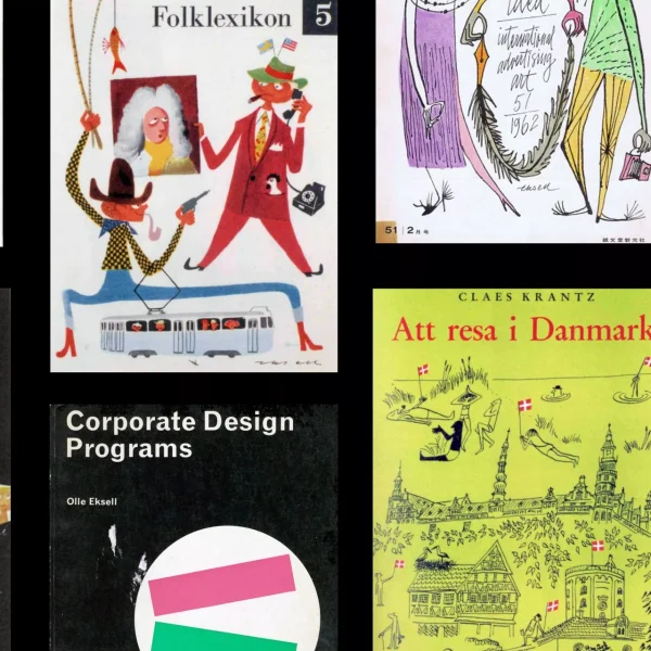
Olle Eksell is well known for his advertising illustration, book jackets and playful packaging design. He first studied engineering and later decided to become a graphic artist. He began his career as a window decorator in 1935, and studied under Hugo Steiner between 1939 and 1941.
- Designer Interview
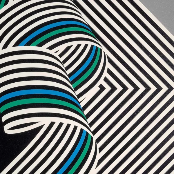
Emiliano Grignani is the grandson of Franco Grignani, one of the most versatile and influential Italian designers. Well-known for his advertising, painting and the way he could visualise motion in such a unique way. I interviewed Emiliano to find out more about Franco and his influence on graphic design and the great resource, https://www.francogrignani.info.
- Design Books
I have always loved the design work created for Olivetti. The colourful midcentury designs by Italian designer Giovanni Pintori, the minimal typographic poster by Swiss designer Walter Ballmer and my personal favourite the 1959 poster for Olivetti designed by Herbert Bayer. I recently found out Triest Verlag released a new book, Visual identity and branding at Olivetti which contains further work by Xanti Schawinsky, Renato Zveteremich, Ettore Sottsass, Hans von Klier, Egidio Bonfante and Walter Ballmer.
- Designer Interview
Elizabeth Resnick is a Professor Emerita, former chairperson of the Graphic Design Department, and current part-time faculty at Massachusetts College of Art and Design, Boston, Massachusetts, since 1977. She ran her own independent Boston design studio from 1973 to 1996, working with many high-profile clients and is a passionate design curator who has organized seven comprehensive design exhibitions. I interviewed Elizabeth about her journey in the field, her early influences and some of the many items in her collection.
- Designer Interview
I have been reproached for this, and I will surely be reproached again. I have also been reproached for reading more and more obscure works whose readership must be limited to a handful of specialists and a few hobbyists like myself. It’s a heavy passion or a passion that sucks.
Members Content
- Design Archive Feature, Members Only Content
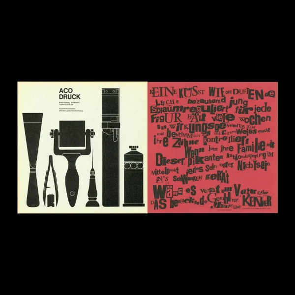
Omnibus was Published by the journalism working group of the Technical University of Braunschweig. A square publication measuring 290mm. The publication included features on politics, arts and culture. With advertisements carefully selected to be in keeping with the visual aesthetic. Content also included exhibition information and a fine example of concrete poetry, among artists such as Schröder-Sonnenstern and Sine Hansen.
- Design Books
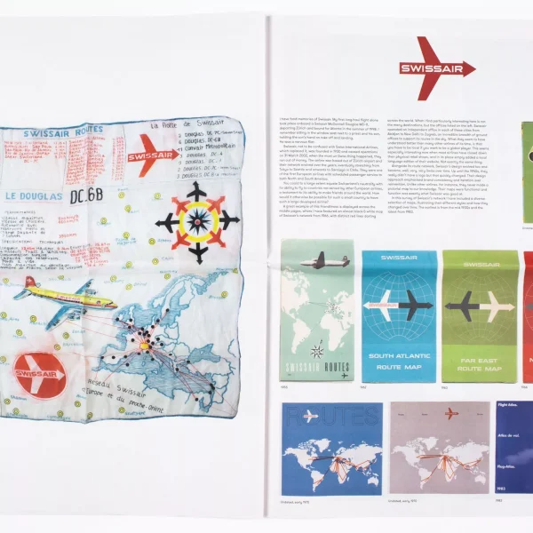
Direction of Travel is a project by Christian Nolle, a half Danish/half German London based artist and map collector. He has spent decades creating work, often in photographic form, that looks at the interplay between aviation, politics and the cities we live in. Christian is also the Founder and Head of Good Caesar, a design and technology studio.
- Design Books
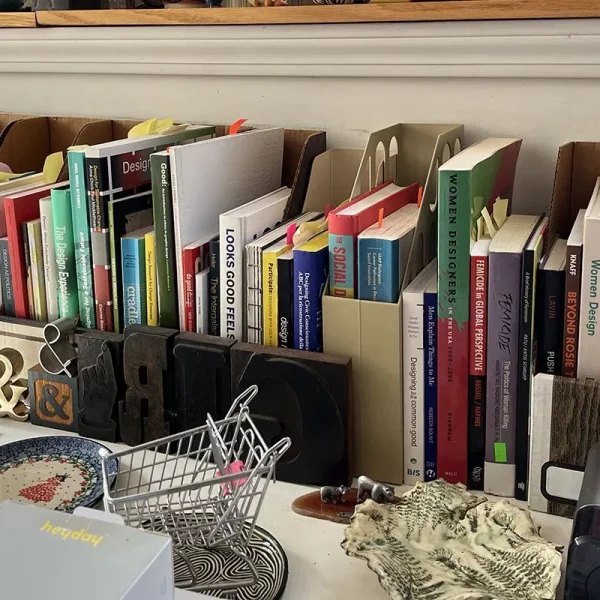
How design can transcend the logics, structures, and subjectivities of capitalism: a framework, theoretical grounding, and practical principles. A new book published by MIT Press written by Matthew Wizinsky.

