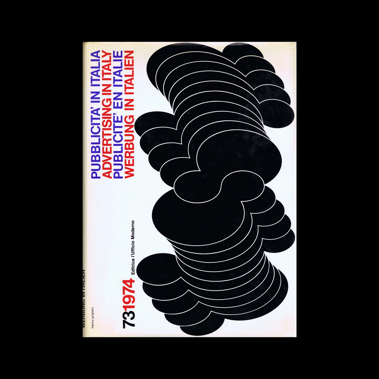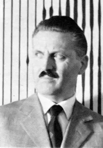
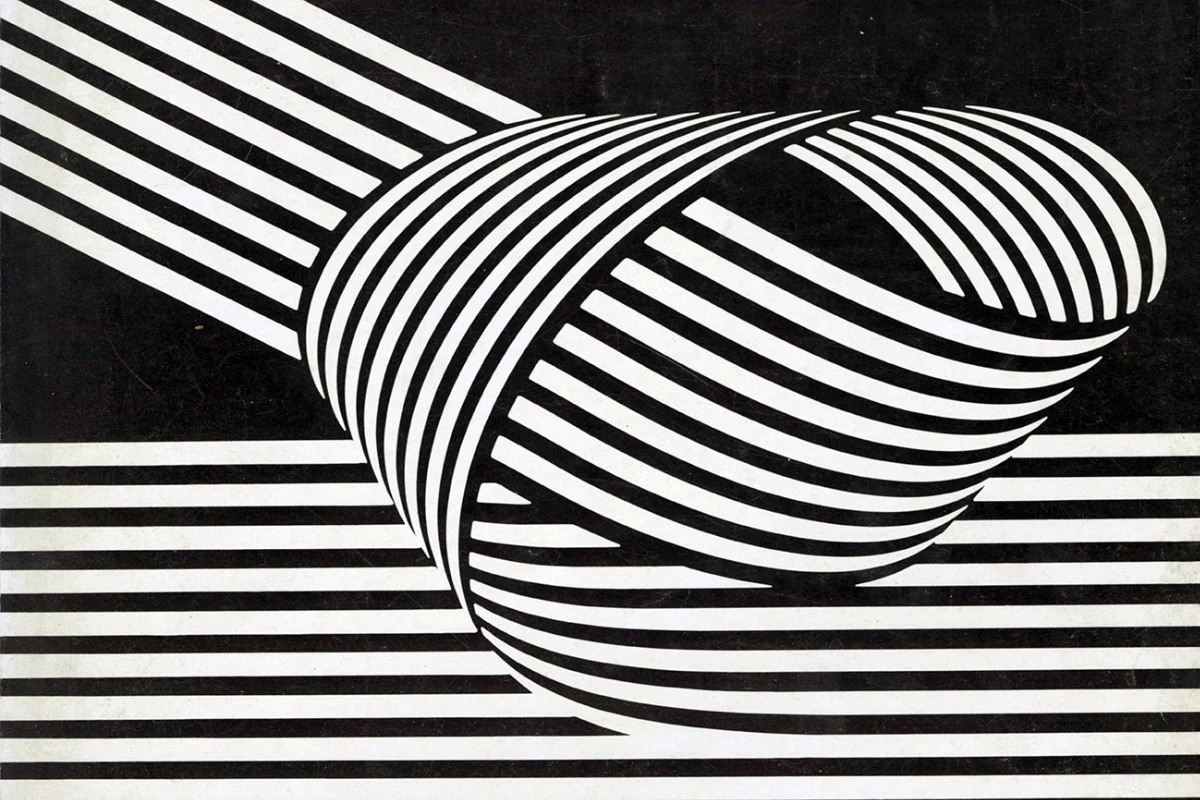
Franco Grignani was born in 1908 and worked across graphic design, photography, and optical experimentation throughout a career spanning six decades.
He is best known for designing the Woolmark logo, a mark that has become one of the most recognised symbols in the world. Deceptively simple, it balances geometric precision with Grignani’s op-art style of movement, a continuous line that feels simultaneously wound tight and in motion.
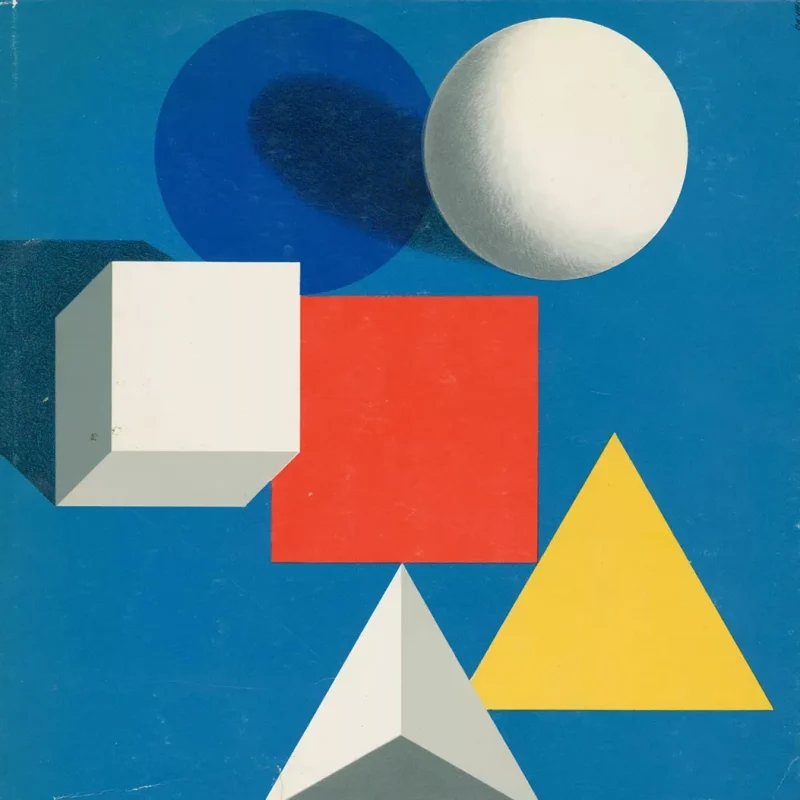
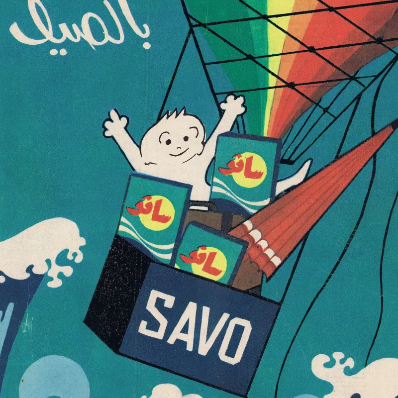
Throughout most of the 1950s, Grignani served as the art director for Bellezza d’Italia. Unlike his optical, black-and-white paintings and the Woolmark logo, he approached these designs with a vibrant palette, using a combination of patterns, photographic figures, and typographic expression to bring to life an otherwise scientific medical publication. His innovative use of colour and design transformed the journal, much like Fred Troller did for Geigy.
His work demonstrates how abstraction can carry both visual and communicative power and how a single designer can quietly reshape what graphic design is capable of.