

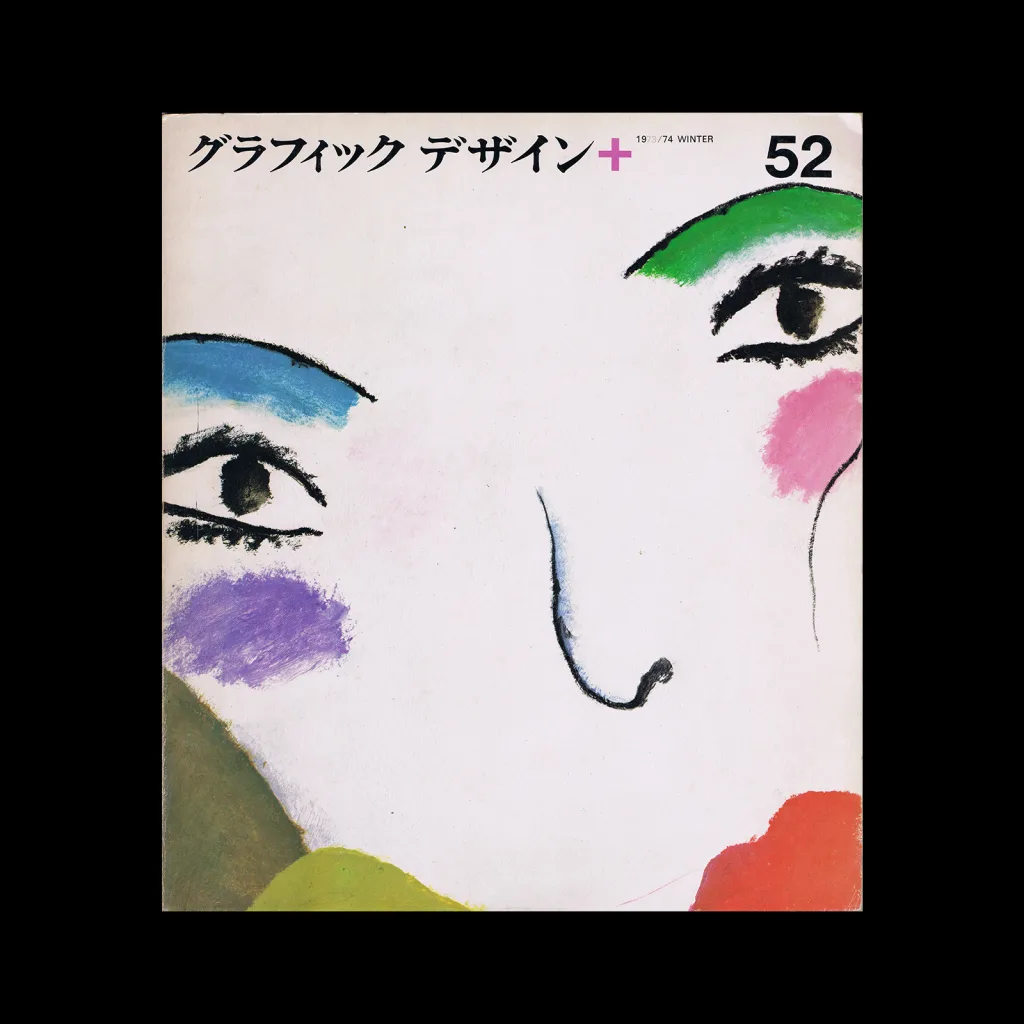
From the graphic design archive:
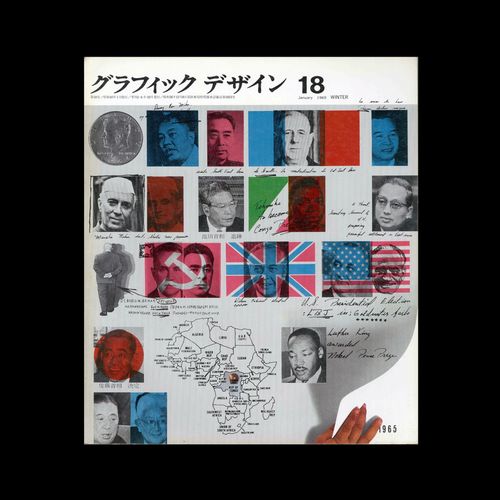
From the graphic design archive:
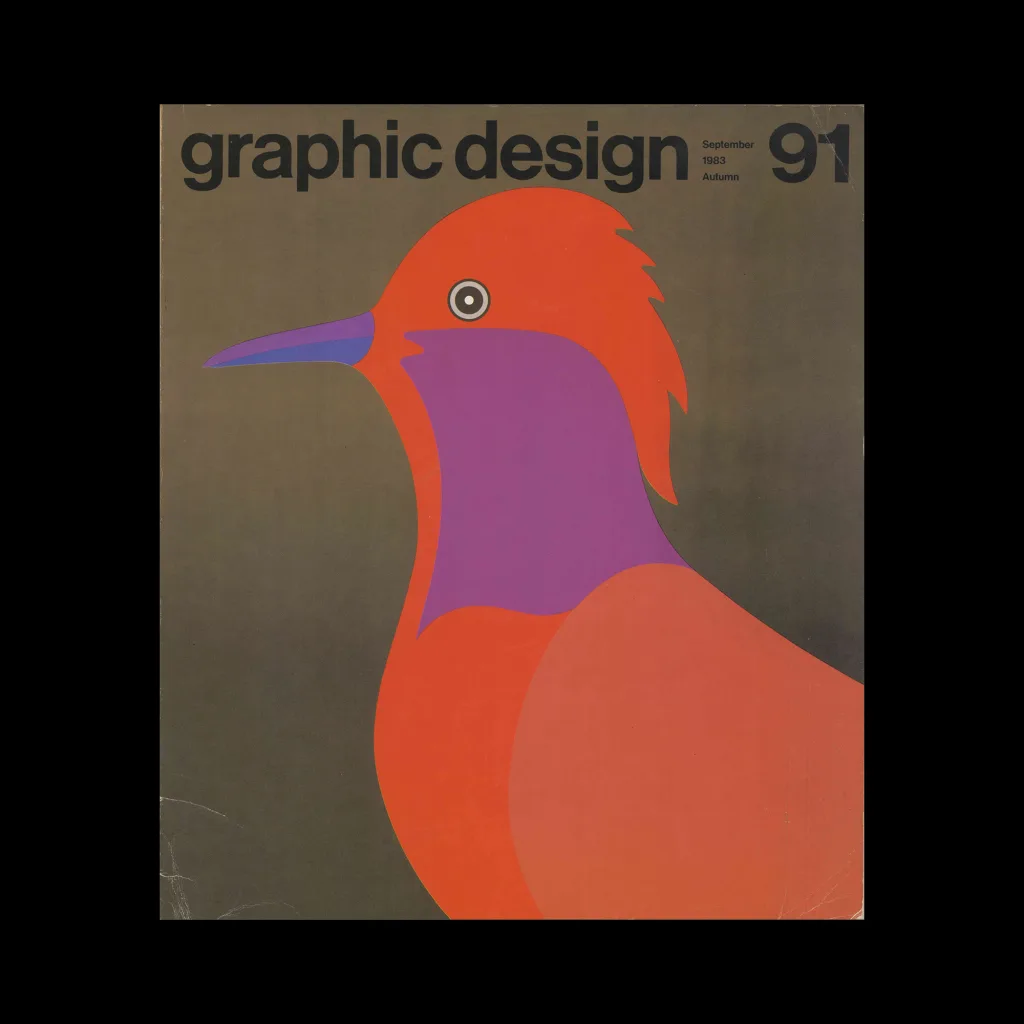
From the graphic design archive:

From the graphic design archive:
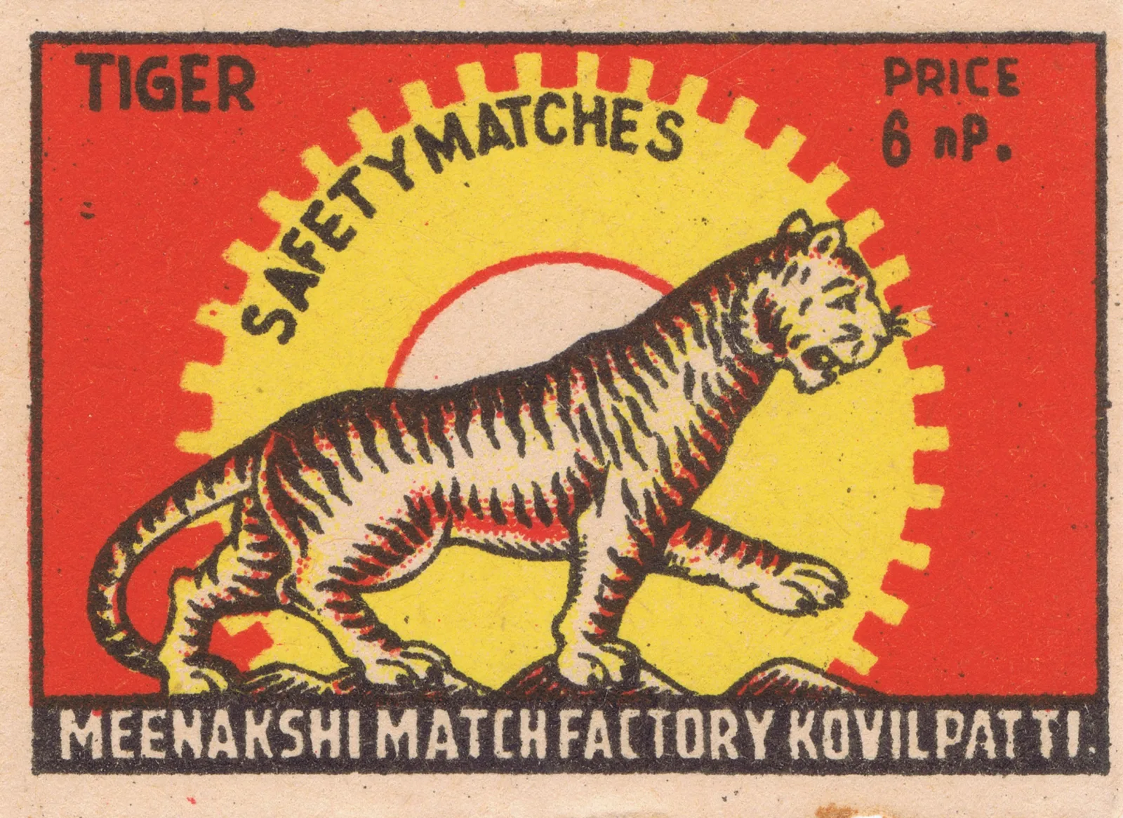
Ephemera, Design Archive Feature, Illustration, Members Only Content
100 Indian matchbox labels, c.1945–1975. Nationalist iconography, illustrated wildlife, and trade marks from small manufacturers across India
Read Article
Helmut Schmid Typography explores the typographer’s oeuvre in its entirety. The book’s generous design allows each image to breathe, and the accompanying texts narrate Schmid’s life and career in an informative and pleasant manner.
Read Article
Design Archive Feature, Members Only Content, Poster Design, Regional Histories, Studios & Collectives
A total of 24 posters were created for the campaign during 1964, using the arrow symbol as a key features, representing power, motion and speed. The handmade lithographs use up to 19 colours, which were individually printed at large scale. The posters also utilise the brand colours red and yellow from Shells corporate identity.
Read Article