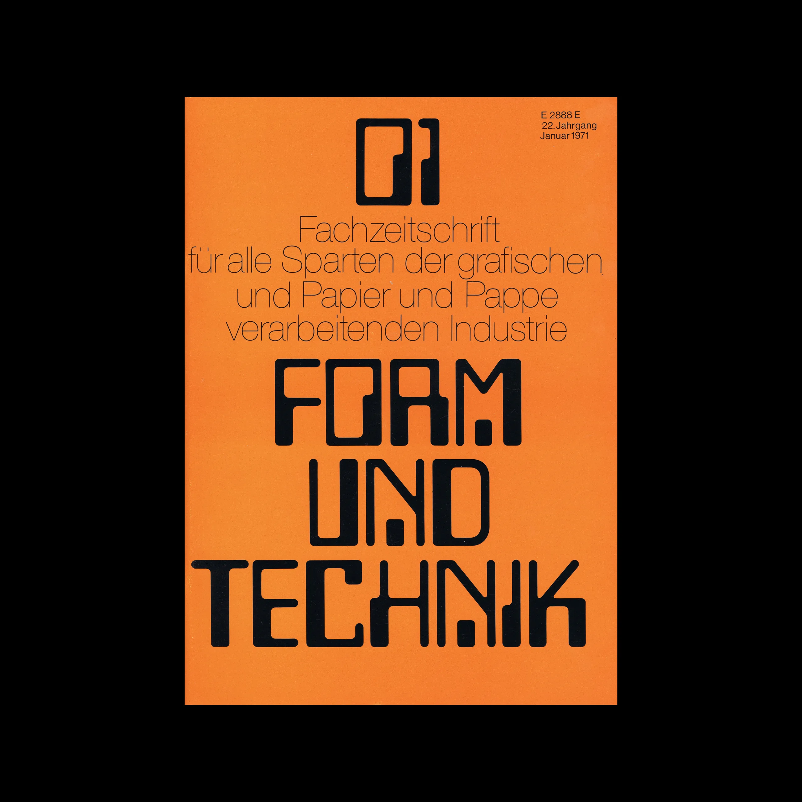

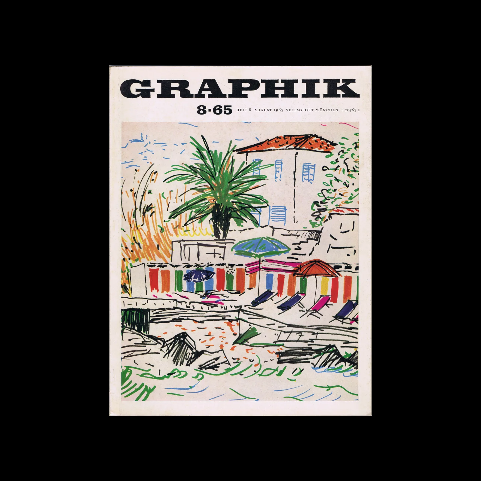
From the graphic design archive:

From the graphic design archive:

From the graphic design archive:

From the graphic design archive:

Design Archive Feature, Designer Profiles, Members Only Content, Poster Design
Scanned posters by the great Michele Spera. Many use a strong use of geometric form, often paired with sans-serif typefaces like Helvetica. Their simplification of form and use of colour create timeliness, recognisable posters that would have stood out alongside the posters of the 1970s which tended to have a heavy use of photography.
Read Article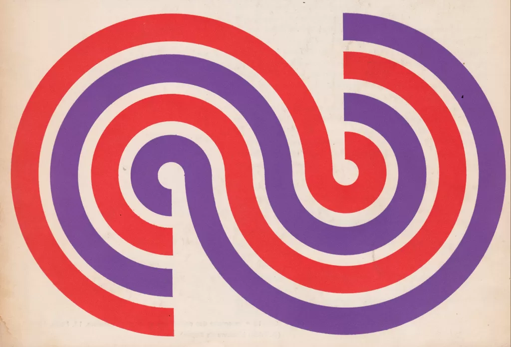
Corporate Identity & Branding, Design Archive Feature, Designer Profiles, Members Only Content, Regional Histories
Crouwel was the successor to Willem Sandberg who used an avant-garde approach in his work, utilising torn-paper montage, mixing of sans serif and old Egyptian typefaces and often off-center positioning. Crouwel steered away from this artistic approach and implemented a cohesive design system and a strong identity that emulated the corporate identity boom of the 1950s and 60s.
Read Article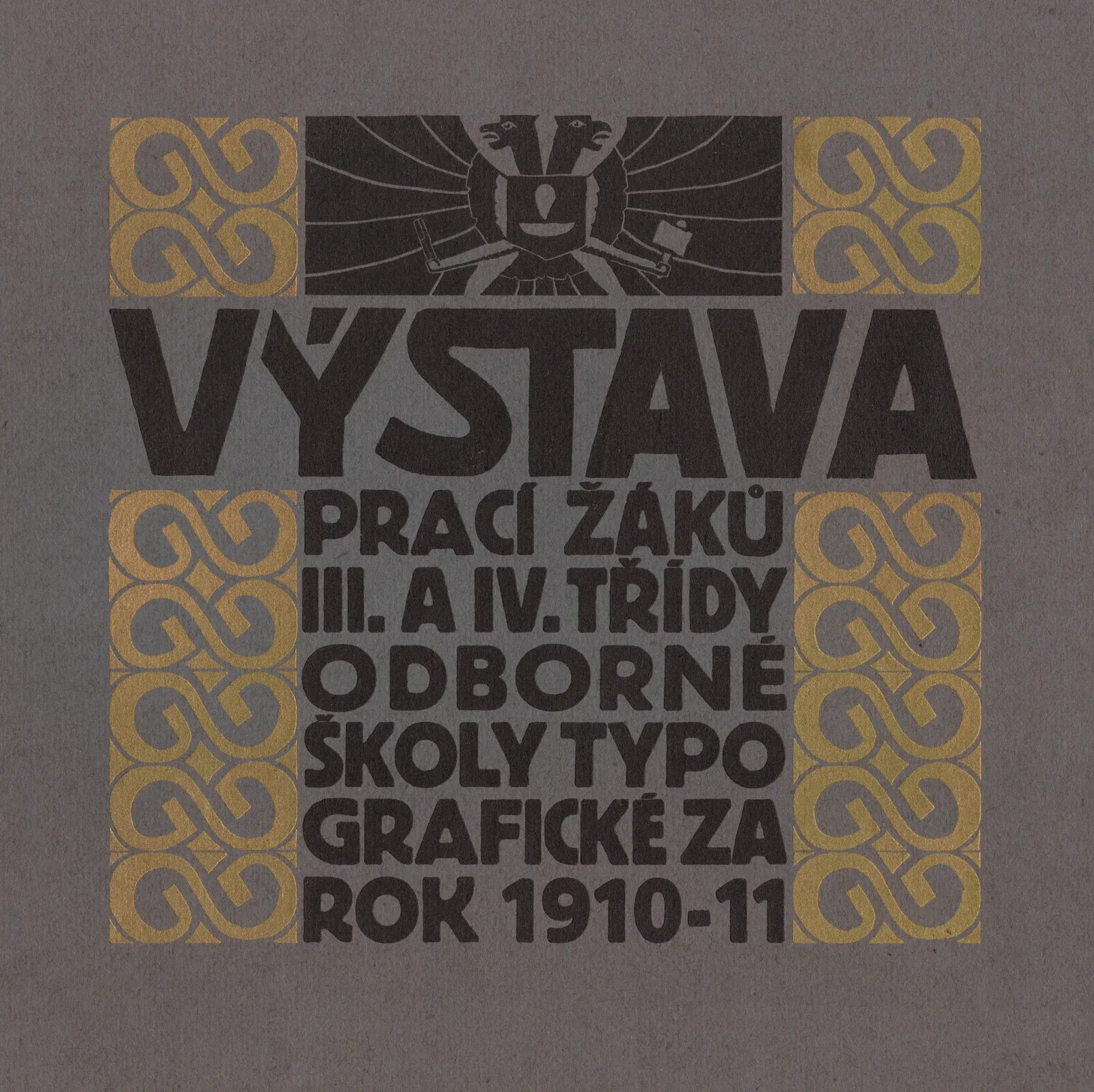
Design Archive Feature, Members Only Content, Regional Histories, Typography & Type Design
60 examples of Czech typography from Typografia Vol. 22 (1911). Czech commercial printing at the crossroads of Art Nouveau and early modernism, with work by Methoděj Kaláb, Alois Chvála, V. H. Brunner and many more.
Read Article