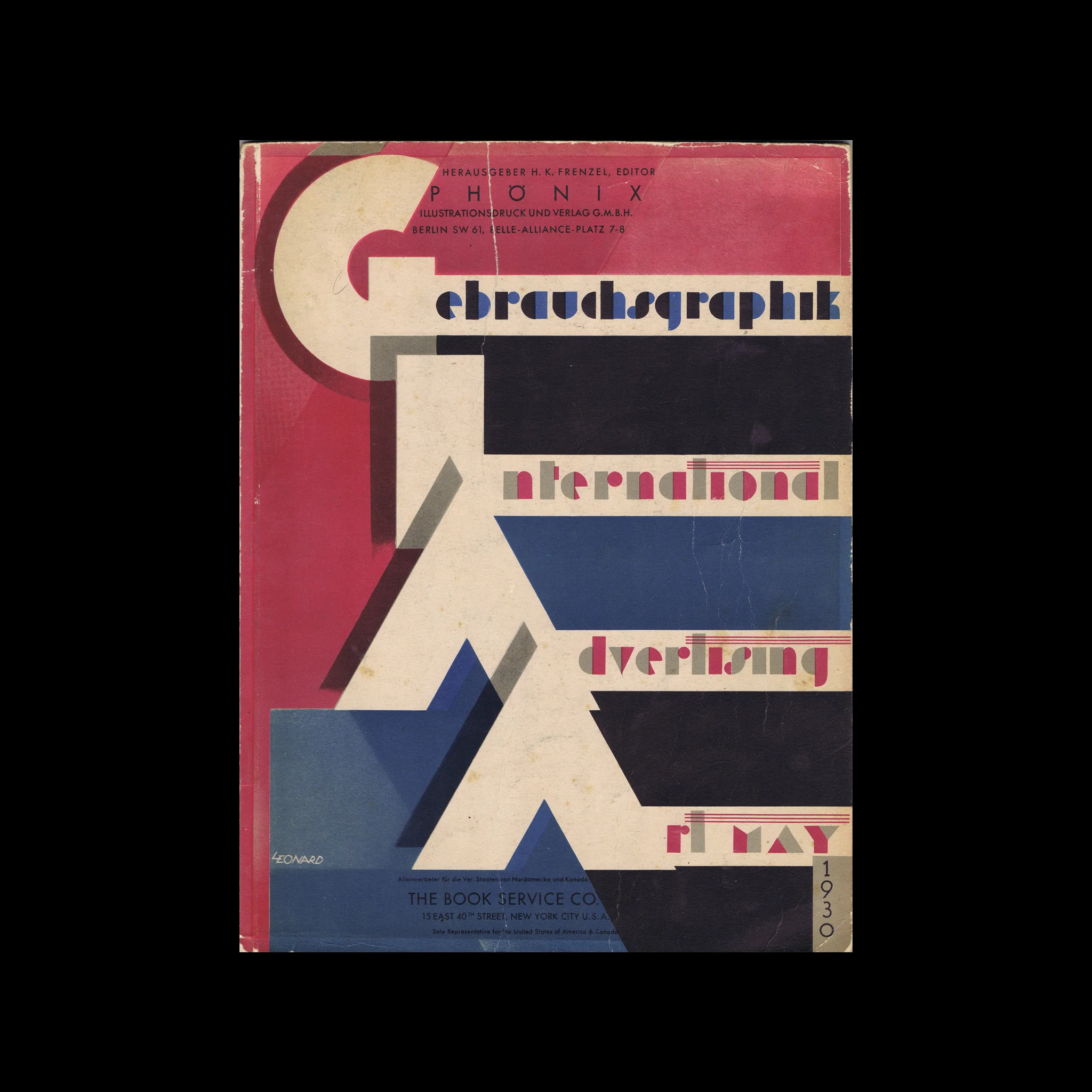

Gebrauchsgraphik, 05, 1930

Selected Contents: Austin Cooper; Berlin und sein Zeichen • Berlin and its »Trade-Mark«; Der Graphiker Cyliax und Gebr. Fretz A.-G., Zürich • The Commercial Artist Cyliax and Gebr. Fretz A.-G., Zurich; Eigenre- klame amerikanischer Reklameagenturen • How American Advertising Agencies Advertise Themselves; Reklame in der »Berliner Illustrirten« • Advertising in the »Berliner Illustrirte«

Selected Artists: Austin Cooper, Walter Cyliax, Helmut Krommer, Hans Leistikow, Robert Leonard, Johannes Molzahn, Niethammer-Mostert, Tommi Parzinger, Eugen Julius Schmid, Lilli Réthi,

Details

Robert Leonard
Gebrauchsgraphik
A German design magazine published from 1924 onwards, devoted to commercial art and advertising design.

Linked Information

Gebrauchsgraphik, 05, 1930. Cover design by Robert Leonard
More graphic design artefacts
More graphic design history articles
43 American Typographic Designers from the 1950s

Design Archive Feature, Members Only Content, Regional Histories, Typography & Type Design

43 American Typographic Designers from the 1950s

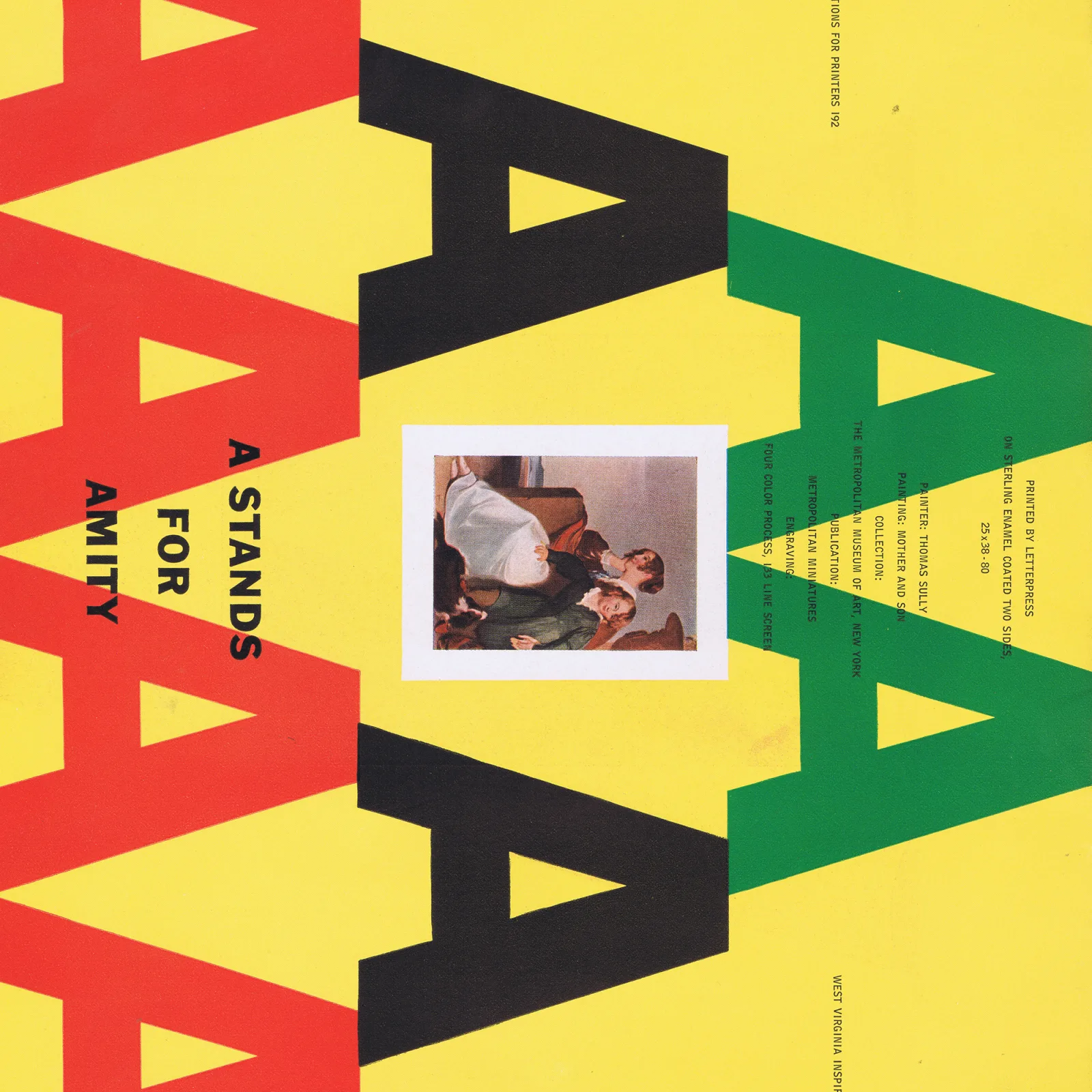
While gathering all my type catalogues, brochures, and instructions on print processes, I found a little book titled 43 American Typographic Designers. I have included biographical notes from the designers featured in the exhibition accompanied by artefacts I have collected that they designed.

Read Article
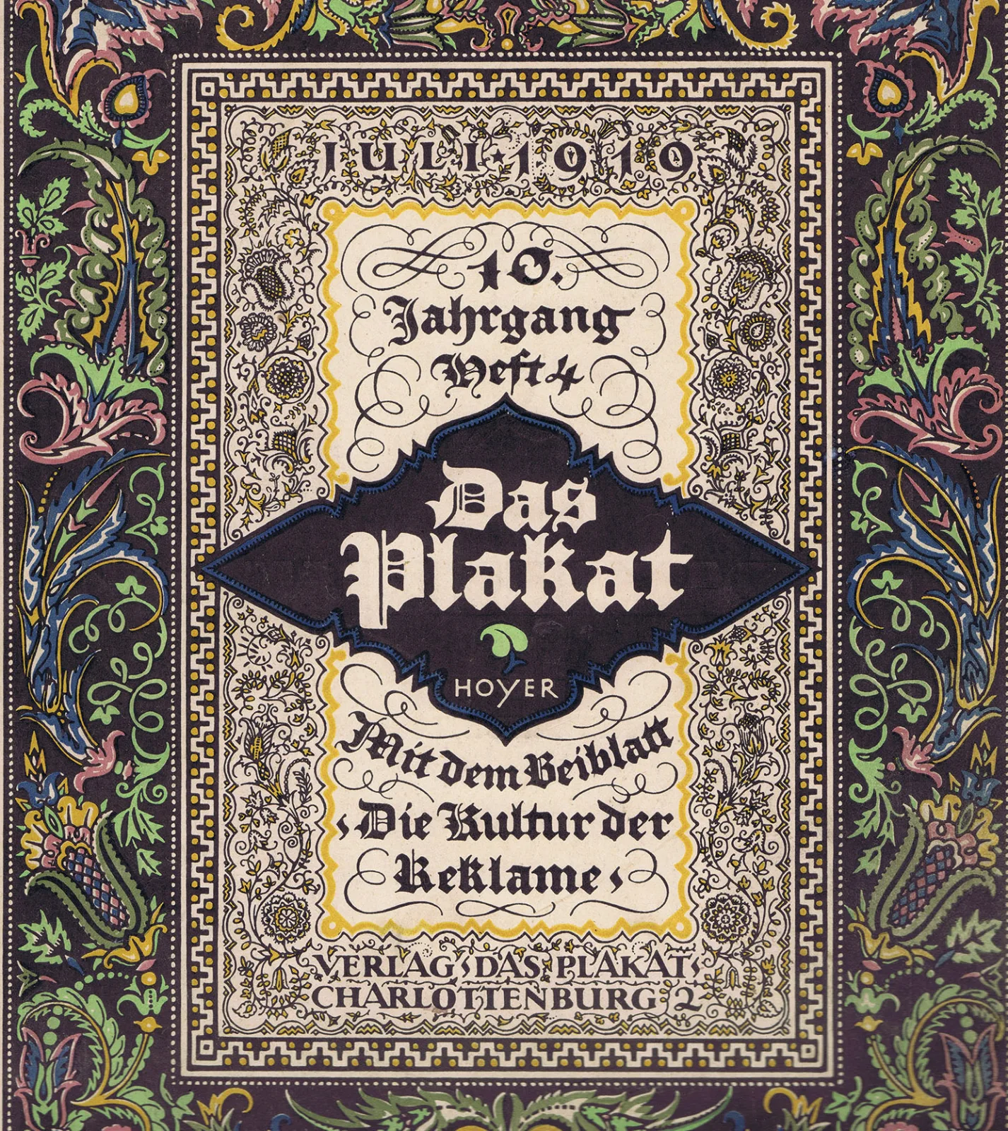
Hanns Thaddäus Hoyer by Fritz Korge (1919): Design Translated

Design Translated, Designer Profiles, Members Only Content, Typography & Type Design

Hanns Thaddäus Hoyer by Fritz Korge (1919): Design Translated

A 1919 article on Hanns Thaddäus Hoyer, originally in German, published in Das Plakat, Vol. 10, No. 4, July 1919.

Read Article
Wolfgang Weingart – Pioneer of Swiss New Wave

Design Archive Feature, Designer Profiles, Members Only Content, Movements, Regional Histories

Wolfgang Weingart – Pioneer of Swiss New Wave

Wolfgang Weingart's artistic design delved into the intricacies of Swiss typography, skillfully dissecting its elements while venturing into texture and type experimentation. His layered montages radiated dynamic kinetic energy, standing in stark contrast to the minimalist approach of his instructors, embracing a more maximalist aesthetic.

Read Article