

From the graphic design archive:
From the graphic design archive:

From the graphic design archive:
From the graphic design archive:

Design Archive Feature, Designer Profiles, Members Only Content, Poster Design
Scanned posters by the great Michele Spera. Many use a strong use of geometric form, often paired with sans-serif typefaces like Helvetica. Their simplification of form and use of colour create timeliness, recognisable posters that would have stood out alongside the posters of the 1970s which tended to have a heavy use of photography.
Read Article
Design Archive Feature, Design Education, Members Only Content, Regional Histories, Typography & Type Design
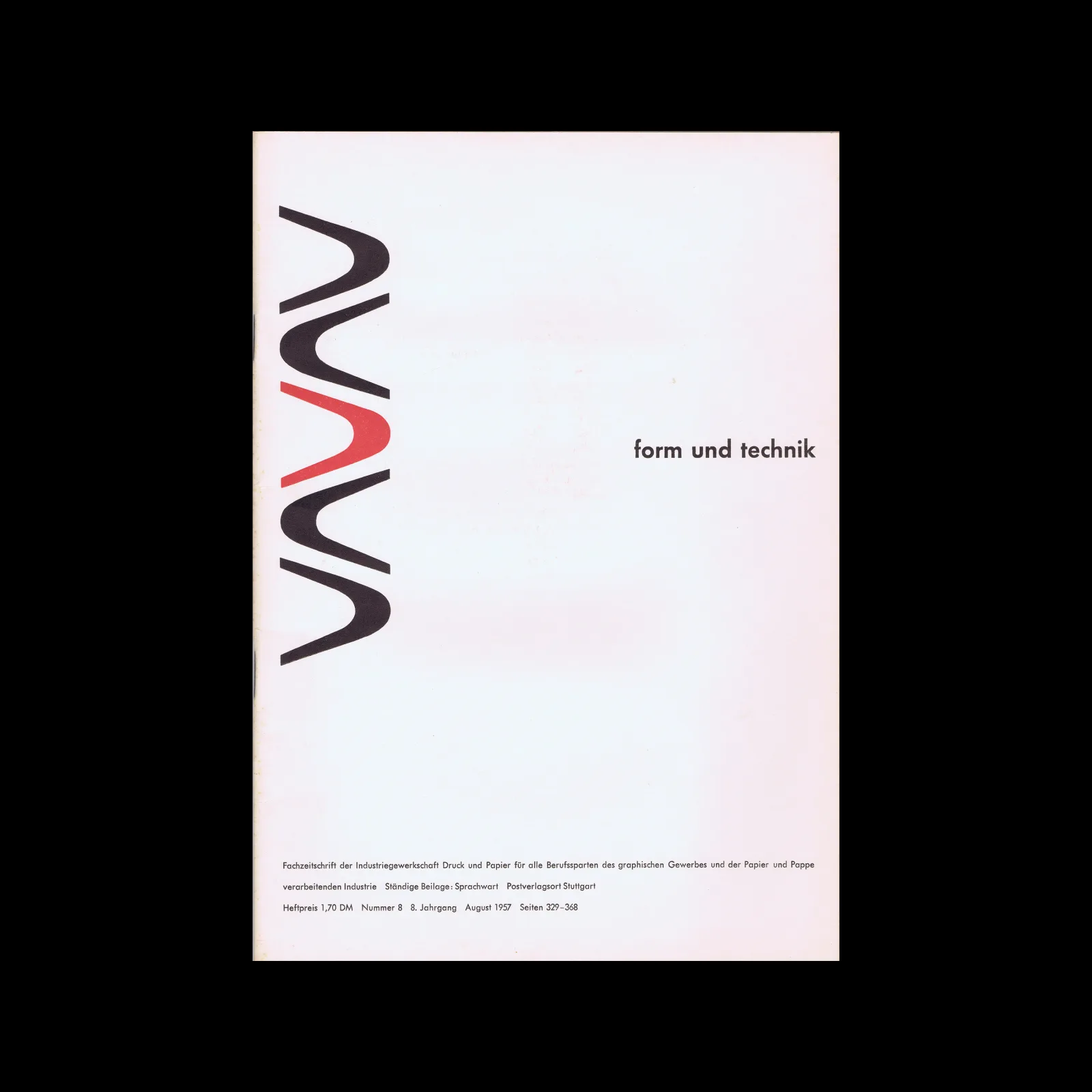
The August 1964 issue highlights the Typography class at the Pratt Institute in New York, a relatively new course at the time. Pratt, one of the most renowned art schools in the United States, had departments for graphic design, painting, art education, industrial design, and applied graphics in the 1960s. The typography course combined theoretical lectures with practical workshops, aimed at students beginning their journey into the discipline.
Read Article
Design Archive Feature, Magazines & Publishing, Members Only Content
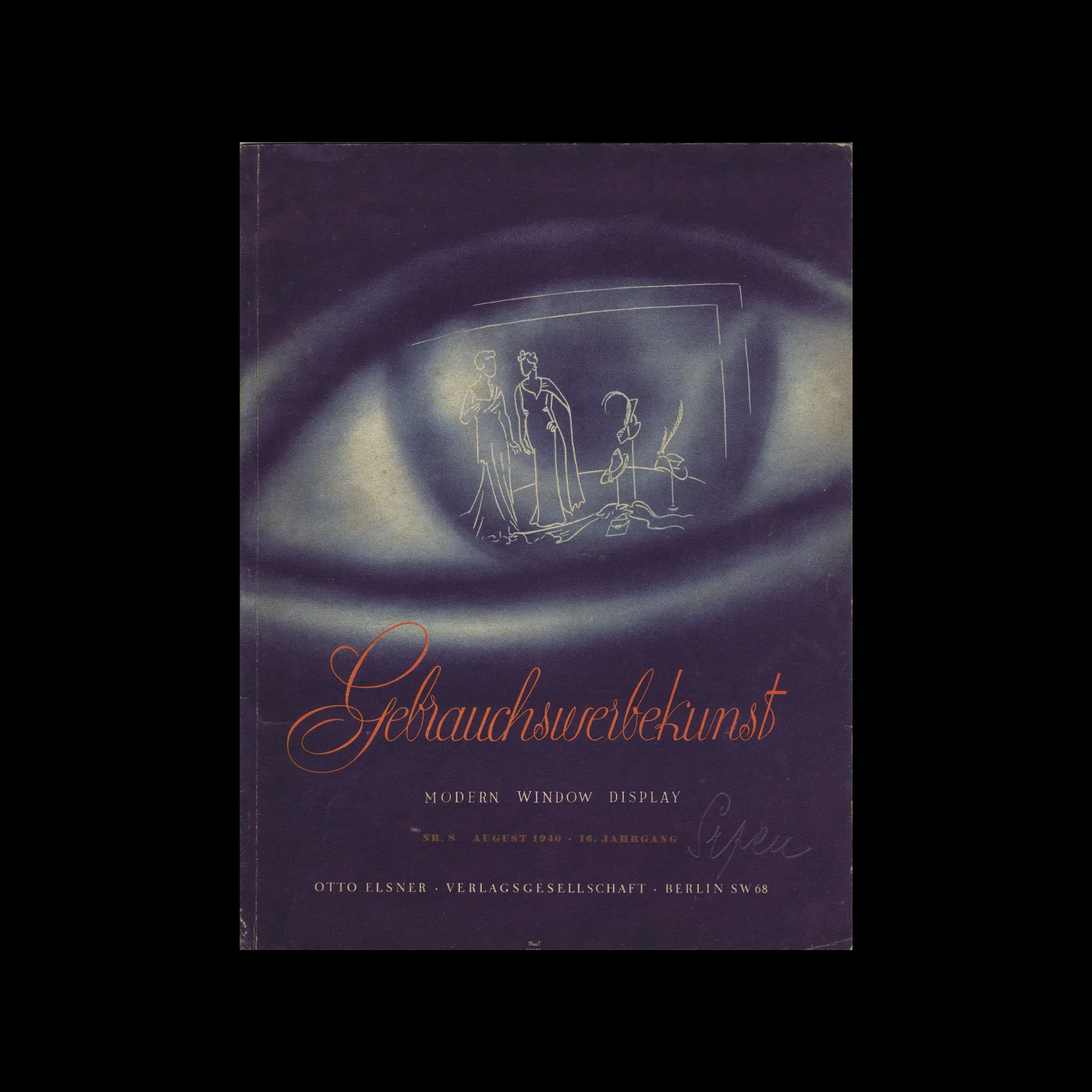
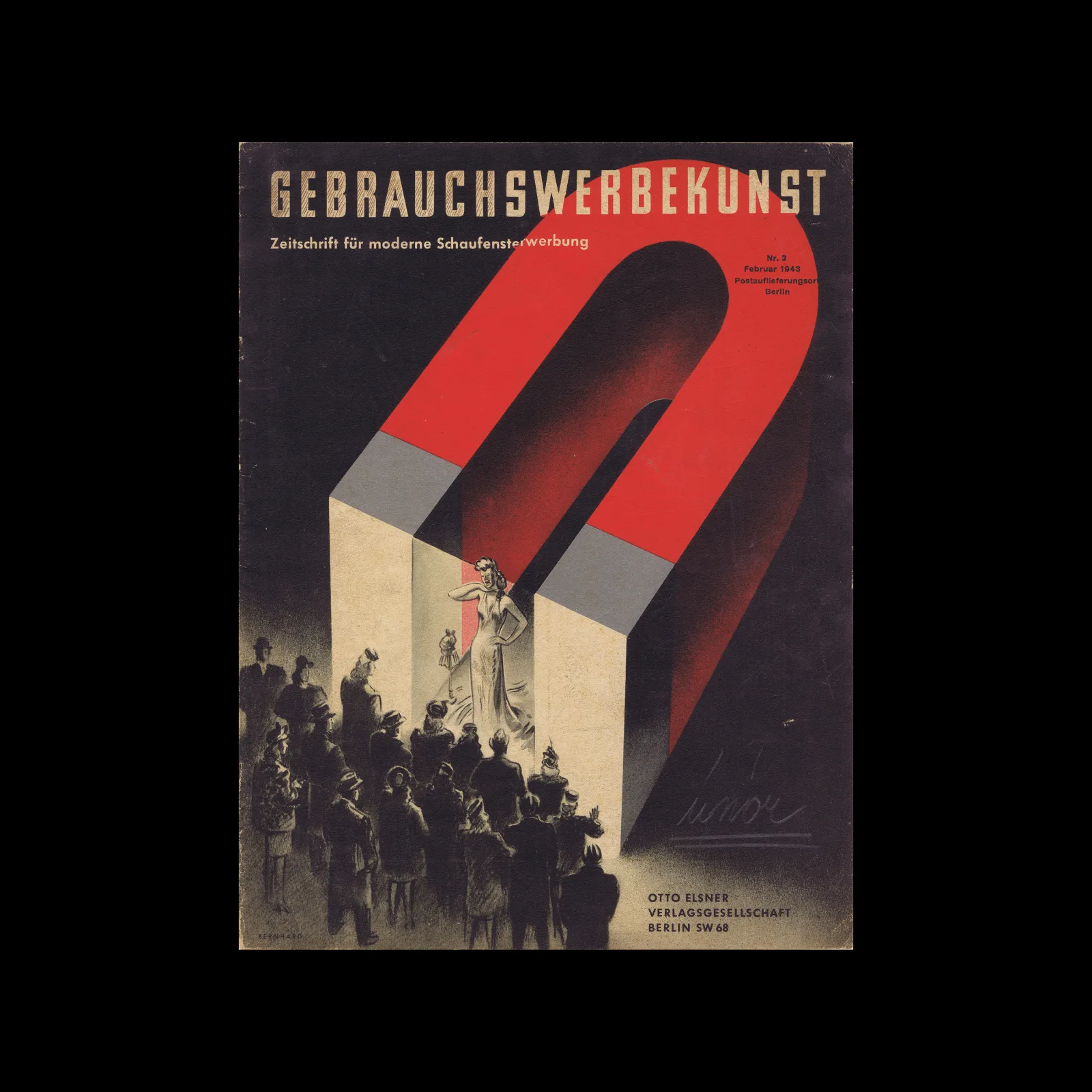
The dedication of Gebrauchsgraphiks editors and publishers significantly influenced the spread and impact of graphic design, documenting countless designers who might otherwise have been forgotten over the last century since its first issue hit newsstands. Design magazines play a crucial role in supporting the design profession and remain vital resources for designers and historians alike.
Read Article