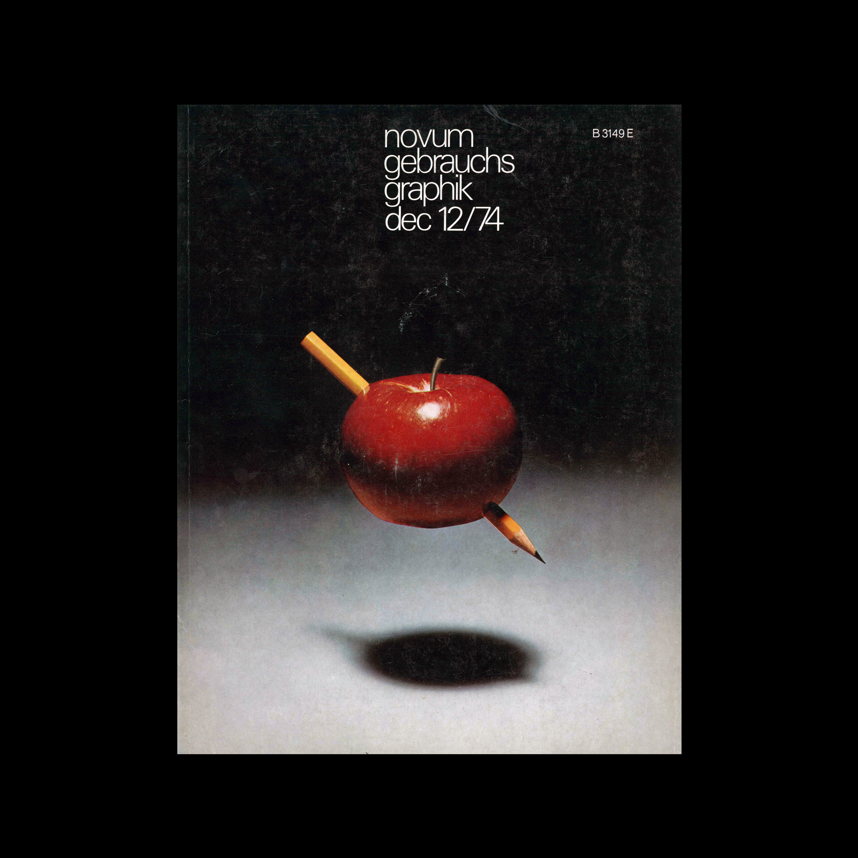

Novum Gebrauchsgraphik, 12, 1974

Content includes:
Alexandre Alexandre – ’Trois siécles d\’affiches Françaises’, the exposition of the Musée des Art Decoratifs
Robert Burns – ADC Toronto 1974
Rudolf Riedler – Medersa Ben Yussuf, photo by Rudolf René Gebhardt
Remigius Netzer – Carl Kock
Hans Baumeister – Warszawa 1974, The V International Poster Biennal
Liselotte Hansmann – Chiromantia

Details

Anisdahl/Christensen
Gebrauchsgraphik, Novum Gebrauchsgraphik
A German design magazine published from 1924 onwards, devoted to commercial art and advertising design.

Linked Information

Novum Gebrauchsgraphik, 12, 1974
Novum Gebrauchsgraphik, 12, 1974. Cover design by Anisdahl/Christensen
More graphic design artefacts
More graphic design history articles
Direction of Travel, an inspirational newspaper by Christian Nolle

Book Reviews & Press Releases

Direction of Travel, an inspirational newspaper by Christian Nolle

Direction of Travel is a project by Christian Nolle, a half Danish/half German London based artist and map collector. He has spent decades creating work, often in photographic form, that looks at the interplay between aviation, politics and the cities we live in. Christian is also the Founder and Head of Good Caesar, a design and technology studio.

Read Article
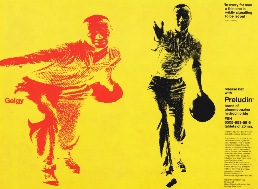
Geigy Chemical Corporation, USA. An Example of Integrated Advertising by William B. McDonald

Advertising Design, Corporate Identity & Branding, Design Archive Feature, Regional Histories

Geigy Chemical Corporation, USA. An Example of Integrated Advertising by William B. McDonald

An advertising programme is fully integrated only when its effect is powerful enough to play a major part in determining a corporate image. Geigy advertising is an example of this successful integration.

Read Article
Arrows of Advertising – An Australian Shell Poster Campaign designed by Frank Eidlitz

Design Archive Feature, Members Only Content, Poster Design, Regional Histories, Studios & Collectives

Arrows of Advertising – An Australian Shell Poster Campaign designed by Frank Eidlitz

A total of 24 posters were created for the campaign during 1964, using the arrow symbol as a key features, representing power, motion and speed. The handmade lithographs use up to 19 colours, which were individually printed at large scale. The posters also utilise the brand colours red and yellow from Shells corporate identity.

Read Article