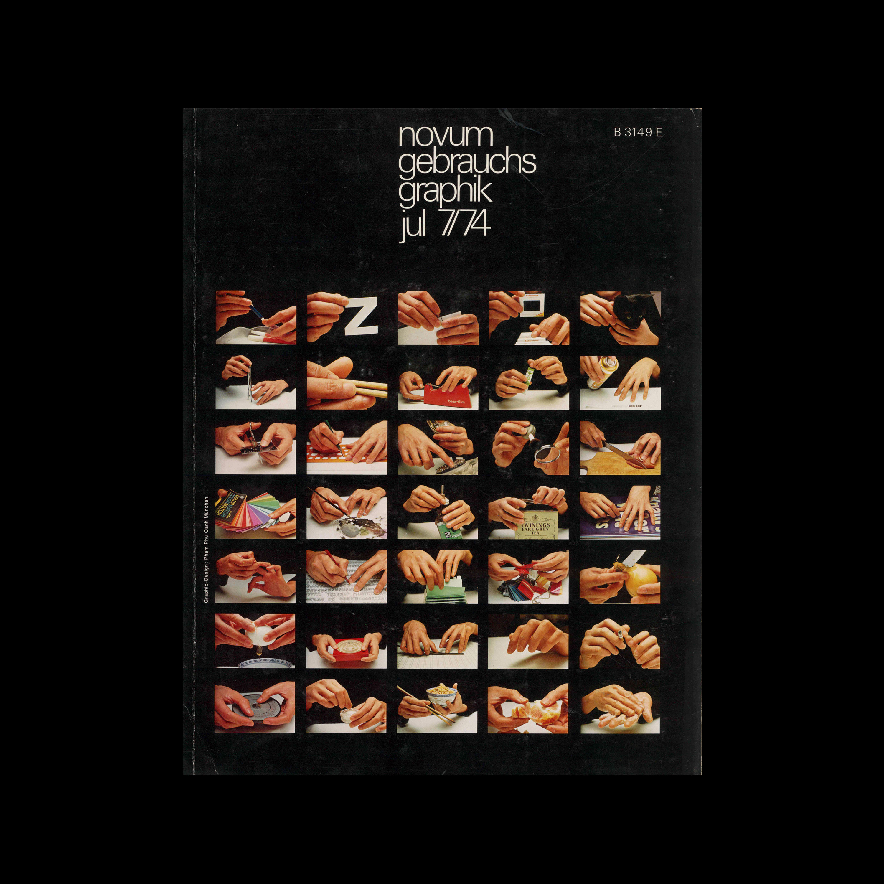

Novum Gebrauchsgraphik, 7, 1974

Content includes:
Alan Fletcher – Alan Aldridge, Illustrations from the children\’s book ’The butterfly ball and the grasshopper\’s feast’
Jochen Gehrmann – The best Swiss Posters of 1973
Günter Griebl – Tv-Grafik-Team
Alexandre Alexandre – Wojtek Siudmak
Kurt Weidemann – Firma Eberhard Bauer
Gaston Roch – Animated Artistic Cartoons in Belgium
Philipp Luidl – OTL Aicher ’Après Olympia’

Details

Pham Phu Oanh
Gebrauchsgraphik, Novum Gebrauchsgraphik
A German design magazine published from 1924 onwards, devoted to commercial art and advertising design.

Linked Information

Novum Gebrauchsgraphik, 7, 1974. Cover design by Pham Phu Oanh

Novum Gebrauchsgraphik, 7, 1974 Inner


Novum Gebrauchsgraphik, 7, 1974 Inner


Novum Gebrauchsgraphik, 7, 1974 Inner
More graphic design artefacts
More graphic design history articles
Jan Slothouber and William Graatsma’s Cubic Children’s Stamps of 1970.

Design Archive Feature, Members Only Content, Regional Histories

Jan Slothouber and William Graatsma’s Cubic Children’s Stamps of 1970.

The stamps for the 1970 editions were designed by Jan Slothouber and William Graatsma in collaboration with the Centre for Cubic Constructions (CCC) in Heerlen.  Every stamp displays a different corner point of the same block, highlighting eight distinct corner points, with four chosen for their unique identities.

Read Article
Wim Crouwel and the Stedelijk Museum

Corporate Identity & Branding, Design Archive Feature, Designer Profiles, Members Only Content, Regional Histories

Wim Crouwel and the Stedelijk Museum

Crouwel was the successor to Willem Sandberg who used an avant-garde approach in his work, utilising torn-paper montage, mixing of sans serif and old Egyptian typefaces and often off-center positioning. Crouwel steered away from this artistic approach and implemented a cohesive design system and a strong identity that emulated the corporate identity boom of the 1950s and 60s.

Read Article
Friendliness and Efficiency. 1970s Postcards for the British Job Centre

Design Archive Feature, Ephemera, Members Only Content, Regional Histories

Friendliness and Efficiency. 1970s Postcards for the British Job Centre

The designer is unstated on these postcards, which were designed during the mid to late 1970s, but these playful illustrations alongside what looks to be Frankfurter Bold definitely fit the criteria of friendliness and efficiency

Read Article